The Honest Truth About Your Website
How a 6th grader can improve your professional site in 4 easy steps.

When people hear trumpeter and composer Wadada Leo Smith’s 2016 America’s National Parks recording, they often ask how many parks he visited for the project.
“None,” Smith says.
“How can you write music about parks you’ve never visited?” they’ll ask.
If there’s a solid answer, it reaches back to his earliest experiences in the Mississippi Delta, where he’d rise before dawn and work in the fields as the sun rose.
“You’re out there where nature is in abundance,” Smith says. “The sun starts at your feet and then moves up to your waist and moves up through your head. And when it moves past you, your appreciation becomes tremendous. When it’s coming up through your body, you feel like you dominate the whole creation. But when the sun passes you, you realize that that’s not true.”
This formative immersion in nature gave Smith a deep and broad view of the natural world. For him, landscape was not something regarded from a distance—not from the window of a rushing car or through the frame of a photograph. Standing in the thick of nature, so wonderstruck that he felt as if he embodied the sun itself, Smith realized that the sun enlivened landscapes everywhere, each as richly meaningful to their inhabitants as the Mississippi Delta was to him.
Smith’s bone-deep awareness of his native setting enriched his imagination with empathy, allowing him to dream-compose his way into other places with both credibility and artistic license. On America’s National Parks, he used his Golden Quintet—a classic jazz trumpet quartet augmented by a cello—to depict existing parks like Yellowstone, Sequoia, and Yosemite, rejecting the literalism of direct representation.

1. Homework: Identify your goals and design the test.
You’ll be designing the test around what you need to know about your website.
The first part of the test will help you learn whether your site is accomplishing your goals.
Thinking about your site, write down three things you want someone to be able to do (or know) within 10 seconds of landing there. Here’s an example: “I want them to know my name, know what services I provide, and be able to contact me about those services.”
Next, reframe each goal as a question:
- “Who is this site about?”
- “What kind of music do they play?”
- “If you wanted to contact this person, how would you do that?”
You can ask any three questions, based on what you want to learn about your site.
The second part of the test is designed to reveal insights about the language on your website. To prepare, identify two pages on your site that are text-heavy (like a bio, mission statement, “about” page, or a page describing your services or programs). Your helper will later read these pages out loud to you.
Finally, prepare your test kit. You’ll need:
- 1 computer
- 1 pencil & paper
- 1 kid
- 1 hour
- 1 phone & tripod for recording video (optional)
2. Recruiting: Identify your partner in crime.
Now that you’ve designed your test, it’s time to choose a tester. The ideal tester is 9-12 years old. The less familiar they are with the nature of your work, the better; you’re looking for someone who will answer your questions based on the information contained in your website, not based on the knowledge already in their head. Nieces, nephews, and neighbors are perfect candidates for the role of intrepid tester!
When you invite your young helper to take part in this test, reassure them that you’re not testing them, you’re testing your website. There is no way to fail the test, and there are no wrong answers!
Once your helper has agreed to participate, explain that during the test, you might take a few notes so that you can keep track of the things you learn along the way. Explain that you’d like to use your phone camera to record the computer screen and their voice so that you don’t miss anything important, and also because it will also help you focus on what they’re saying, instead of taking notes the whole time. Ask them if they’re ok with that. If they say no to video, respect it and take notes instead.

3. The day of: Conduct the test!
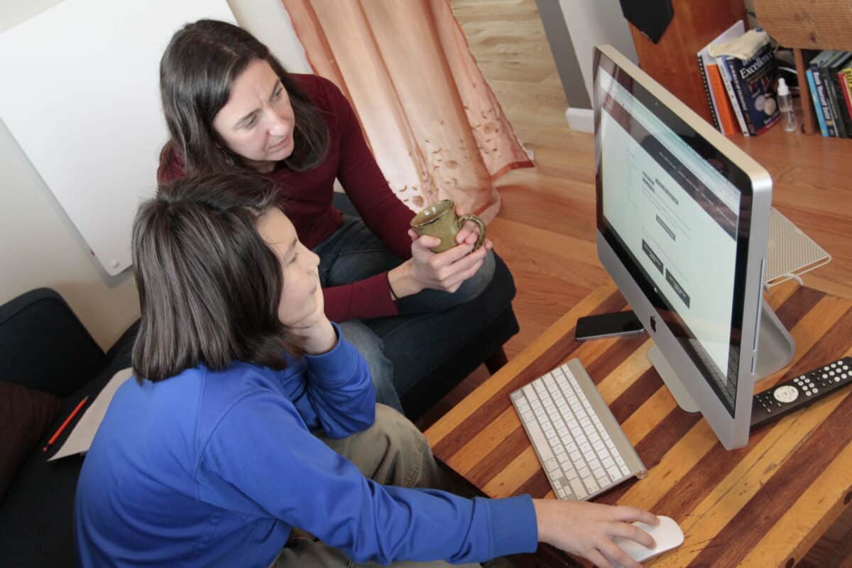
The big day has arrived! Set up your user testing “lab” wherever your helper is most comfortable, making sure they can comfortably reach the mouse and keyboard. Sit or stand nearby, so that you can see both their face and the screen. You’ll want to see their reactions in real time.
Gently remind your helper that you’re not testing them, you’re testing your website. Let them know that if they get stuck at any point, that’s when you get to learn the most – so they should tell you when the site is confusing, or if something unexpected happens – good or bad. Encourage them to keep a running commentary out loud as they go: “I’m looking for the menu… I clicked on this button but it’s not doing anything… This is a funny picture…” etc.
If you have permission to record video, this is a good time to prop up your phone on the desk, using books or a tripod, zooming in so that you can see the computer screen clearly in the video. Let your helper know you’re starting the recording, and press record.
Now, let’s begin!
Load your homepage and ask your helper the first question you’ve prepared. Then, step back and watch as they explore the site to answer the question.
As this adventure unfolds, you’re watching for one of 3 things: (a) they answer the question with ease, (b) they stumble along the way but eventually find the answer, (c) they hit a wall and give up. Don’t help them answer the questions , but if they lose focus and wander off course, you may gently steer them back to the task at hand. If they get too frustrated or stuck, let them off the hook by gently moving on to the next question. Save any explanations (spoilers!) for the very end.
Work your way through each of the questions. As new questions arise, note them for later, in case you have time for more.
Once you’ve exhausted the question list, navigate to one of the content pages you’ve selected for the lingo test. Ask your helper to read the page out loud, and encourage them to stop and tell you when something doesn’t make sense, or if there’s a word they don’t understand. Do they stumble? Laugh? Make faces? Sometimes we take context, tone, or terminology for granted and forget what we’re assuming about our audience. Kids make assumptions — but they probably don’t assume the same stuff we do. This is handy.
With the lingo test complete, you can thank your helper and set them free! See them safely home (or maybe bake some cookies together first). Now it’s time to size up your findings.
4. Follow-up: Filter the feedback & make changes.
Testing is the easy part. The harder part is figuring out what the feedback means, and deciding what to do with it.
Start by watching the video. Not all of the feedback will be relevant — for example, you’re likely to need at least some industry-specific language in your bio that goes beyond 6th-grade vernacular— but some low-hanging fruit should jump out at you right away. In particular, take note of navigational confusion and buttons/links that don’t behave as expected. Kids are excellent navigators of the internet, and if they’re struggling with the navigation on your site, age is unlikely to be the reason. It’s far more likely that something on the site needs work.
Also listen carefully to the words your helper uses when talking about what they’re doing on the site – specifically how they label various pages, menus, and buttons (eg, you have a “Professional Bio” page, and they call it “the page about you”). Their words can sometimes be far more natural than the awkwardly marketing-y terms we lean on when attempting to promote our own work. There may be some gems there as well.
Finally, this exercise is easiest to record on a laptop or full-sized screen, but it’s worth doing on mobile as well. If you typically use a computer to do work on your website, mobile testing is more likely to be reveal something you hadn’t noticed.
Delights await. Have at it, and have fun!
* This exercise is a small piece of a much larger usability discipline. If you really want to get sucked in, check out Steve Krug’s Don’t Make Me Think: A Common Sense Approach to Web Usability and Rocket Surgery Made Easy: The Do-It-Yourself Guide to Finding and Fixing Usability Problems.
Case Study: Common Tone Arts
Organization: Common Tone Arts
Website: www.commontonearts.com
Testing team: Kohen (age 11) and his mom, Kimberly (co-founder)
Questions:
- What does Common Tone Arts do?
- How can someone donate to Common Tone Arts?
- If someone had a question about Common Tone Arts, how could they email / contact the organization?
What did you learn?
It was a relief to find out that things on the website that I was worried might not be obvious or easy to navigate were not problematic. Kohen was easily able to navigate through menus, and the labels and buttons made sense to him.
It was also helpful to hear him read aloud many of the lengthier sections we have written, and to realize that perhaps a softer, less “grant type” language would be more inviting to a first-time visitor to the page. We also found a broken link on the homepage. It’s been a while since we reviewed every part of the site in detail, so it was great to comb through it like this.
I’m intrigued as to how our younger son would have worked through this exercise, and I definitely plan on having him try it as well!
How did you follow up?
- Fixed the broken link on the homepage
- Fixed language in our donation workflow
- Planned to discuss/review the overall language on our “about” pages, to address academic-sounding wordage
- Planned to reevaluate the clarity of our different programs as described on the website
Any last thoughts?
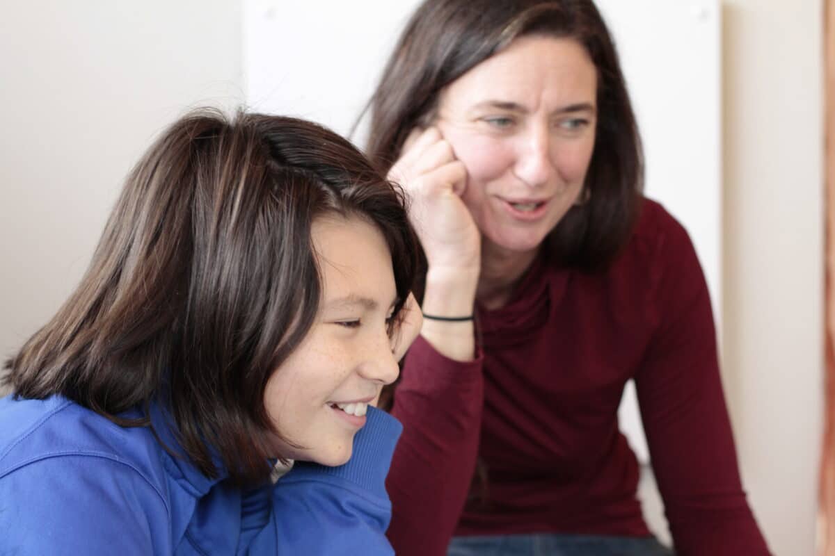
I checked in with Kohen regarding how he felt about the experience, and he got a huge smile on his face and said “It was fun!” He knows that CTA is something that (co-founder) Brian and I are very dedicated to, and I think he felt quite proud and empowered that his insights and thoughts provided us with valuable information. For him, the activity was a bit like a puzzle to figure out, and he really liked doing it.

